Moluv.com Redesign - Again
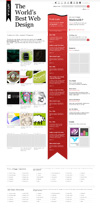 This time I think we have a winner. The previous version of Moluv.com was heavily based on a what was originally just a placeholder layout. It was confusing to some, and it became a little chaotic for my taste.
The new version states pretty clearly what the site is about - great web design. New links are front and center, and featured site thumbnails are now clickable and slightly smaller to get more in a page view. The massive collection of links that were previously taking up space higher in the page are now at the bottom. They're still easily accessible, but now there's room for news items.
There are still a few tweaks here and there that need to be addressed, but, hopefully, the changes will be for the better. If you have any comments on the new design, feel free to share. Take care, and happy browsing.
posted by moluv at 10:27 AM
![]()
![]()


1 Comments:
looks good! big MO!
what's new?
-BJM
Post a Comment
<< Home